Rebranding – Why, How and a Checklist
By Leslie Richards
Rebranding is an initiative companies do not undertake lightly. There is a component of self-reflection required that may feel like a luxury in the face of fast-paced work environments. There is a great deal of work involved. However, the upside of a rebranding project, done correctly, can be just as significant as the effort. If your organization is making substantive changes, a rebrand helps communicate that internally and externally. It can provide strong visual reinforcement for your change management initiative.
Start with Why
As with most marketing and communication initiatives, the best place to start any marketing project is with the question “why?”
Ask: Why are we undertaking a rebranding project?
There are some good reasons, and some not so good reasons. Let’s start with the positive.
Reasons to rebrand include:
-
- A significant new service line or product.
- A significant milestone in your company’s history.
- A merger with another organization.
- Succession of leadership that represents a new approach to your business.
- A change in your industry or competitor’s brands that has put your brand at a disadvantage.
- A brand that has encountered a significant issue in the digital space, such as another entity with a similar URL or search profile.
Reasons not to rebrand include:
-
- Covering up or distracting from a problem without addressing the root cause.
- A change in management or in the team heading up marketing.
- You simply don’t like it or the colors and haven’t asked your buying audience what they think.
- Because you received an unsolicited sales email from an unknown agency telling you that you should rebrand.
Your brand is about the intrinsic qualities of your organization, not the people running the marketing program at a particular point in time. You also don’t rebrand simply to get attention from your audience. Create genuine interest in your brand by being innovative, helpful and diligent in your space.
Defining Scope and Laying Ground Rules
Once you’ve determined that a rebrand is appropriate, the next step is determining the scope of that rebrand. Is it a light visual update or a complete overhaul? Should the tagline change? Is it a significant update that includes a new name?
Many organizations already have some brand equity. They have been around long enough to have gained a degree of recognition with their key audiences. If you have had a website for any length of time, it is likely that your brand assets, such as your logo, have been picked up by directories and other online platforms. A Google image search for your name will give you some idea of how widely your visual identity has saturated the online space. For these reasons, a solid refresh rather than a complete overhaul is the more common approach.
Once you have identified the scope, determine the key stakeholders for the rebrand. Who is included in the review process? To what degree do you solicit feedback from your team or from those outside your organization? Determine who has final approval.
Design by committee rarely produces the best results and yet buy-in for any initiative is important to adoption and success. You will need to weigh these competing factors based on the dynamics of your organization.
Creative Considerations
In my several decades as a creative director in agency environments, I have guided many clients through rebranding projects. There are three key elements of a visual brand update that should be considered: color, iconography and typography.
What to consider when choosing color
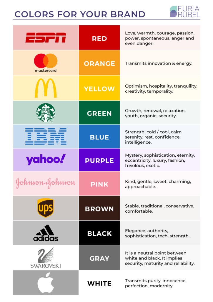
Our human brains are wired for pattern recognition and the most memorable visual identifiers for our species is color. You can name companies almost without thinking if I give you the following cues:
-
- Business technology – blue
- Soda – red
- Donuts & Coffee – orange
- Personal computers – white
- Luxury jewelry and fine china – light blue
- Home repair supplies – orange
Chances are you had the following associations:
-
- IBM – blue
- Coca Cola – red
- Dunkin Donuts – orange
- Apple – white
- Tiffany – light blue
- Home Depot – orange
Color should be determined based on your target audience and the emotional space you want to create with them. Is that space trustworthy and supportive? Do you want to convey that you are fiercely competitive and will help them achieve their goals? Or do you want to appeal to intellect and sophistication? These things will impact your decision about color.
Remember that color associations change based on demographics of age, gender identity, and class. If your brand is international, be aware of the different geographical associations with colors, as these change across cultures.
Last, color associations change with time. Think about the change in what we consider to be attractive colors for kitchen appliances. Think about the avocado greens and harvest gold of the 70’s? How do these compare to the stainless-steel finishes popular today? A kitchen with a harvest gold stove looks dated. Similarly, there will be times when you need to adjust your color to convey relevance and awareness of trends in your industry. Do so carefully and stay within the same general family, even as you adjust.
The choice of color will be one of the most important you make about your brand, for it is a brand element that will be very closely associated with your company even if other aspects of your brand are less memorable.

How to approach typography
While visual communicators like designers may be able to identify subtle differences between fonts, the average viewer may not. It is worth giving thought to typography and font choice none-the-less. The same word displayed in a different font, conveys a different message based on the personality of the font. John Maeda, former President of the Rhode Island School of Design lays out the impact of type choice in a great TED talk about typography. Maeda uses the word Free as an example:
FREE
(Liberation movement)
Free
(product give-away)
f r e e
(light and breezy)
Rather than relying on personal preference, make sure the font conveys the message you wish to convey to your target audience.
Icons and symbols:
Some logos contain a symbol, graphic or icon that accompanies the typographic presentation of their name, often referred to as a logo mark. Examples include the Nike swoosh, the McDonalds arches, and the red bullseye for Target stores. Done well, these logo marks can become a stand in for the full company name, and the associated connotations. While there are many online resources for low-cost or free logo marks, it is worth investing in professional logo design if your budget allows.
When considering logo graphics, think about the following:
-
- How will this logo mark reproduce in a range for sizes from very large to very small?
- How will it perform in both black and white, and in color? You will not always have the option to present in color.
- Does it contain gradients or very fine lines that will be hard to reproduce in all situations?
- Does it contain elements that are very tied to current trends and that may not age well?
- How does it compare to other logos in your space? Is it easy to distinguish from your competitor’s logos?
- Have you done a trademark search to ensure that your logo is not infringing on someone else’s registered trademark?
- What story does the logo mark tell?
Before finalizing, consider trademarking your logo. Doing so ensures that your logo is your intellectual property and that it can’t legally be used by another entity. More details can be found here.
Small Changes Can Make a Big Difference – Case Studies
Not every rebranding project needs to be a big undertaking. Big consumer brands regularly make tweaks to their existing brands in ways that maintain continuity but avoid feeling dated. Dunkin Donuts recently made a small adjustment in their orange – a change you would only notice by putting them side by side. They also dropped the word “Donuts” from the name.

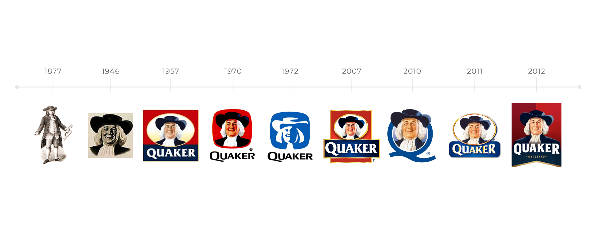
One well-known case study is the evolution of the Quaker Oats logo from 1877 to today. The character is consistent throughout the 145-year history of this iconic brand, but the treatment of the character has evolved to respond to the style of the time.

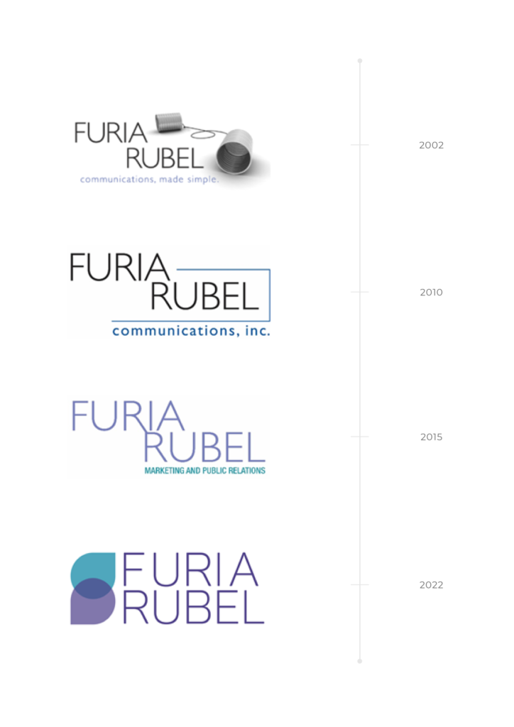
The Furia Rubel logo, while not a household consumer name, has undergone its own evolution over our 20-year history. Our original logo reflected the playful, entrepreneurial spirit of starting a new venture. Over time, it evolved into something more refined as we identified a niche in the business-to-business space with a concentration in the legal vertical. Our newest iteration, developed in time for our 20th Anniversary, reflects the way in which our industry has adopted digital strategies by referencing chat icons, and making them our own. In all the logos, we have maintained a focus on the core skill set of our team members, that of effective communication regardless of the platform in which that communication takes place.

Implementation
Like moving out of an old home and into a new one, you are likely to find remnants of your old brand squirreled away in a broom closet that you have forgotten to clean out. This can undermine adoption and create situations where the new brand fails to take hold. A checklist of areas that need a good sweeping help avoid this.
Rebranding is a big project, so start with the most frequently seen marketing items and work your way through the list. In today’s world, your website, Google business profile, and social media platforms should be at the front of the line. Then move on to print, and save internal interfaces for last, but don’t neglect them.
Here’s is the list we developed for ourselves during our recent brand update:
REBRANDING CHECKLIST
Digital Assets:
- Digital Letterhead
- Email Newsletter Mastheads
- Email Signature
- Google Business Profile
- Podcast Branding
- Social Media
- YouTube
- Other
- Website
Capabilities Documents / Pitch Decks / Branded Content:
- Brochures
- Capabilities and Pitch Decks
- Case Studies
- Contracts
- Corporate Informational Materials
- PowerPoint Templates
- Proposals
Printed Materials:
- Brochures
- Business Cards
- Envelopes
- Folders
- Forms
- Labels
- Letterhead
- Notecards
- Signage
- Swag/Giveaways
Miscellaneous Assets:
- Apps
- Employee Manual
- Invoices
- Trade Show Displays
- Zoom Background
Directories:
This one is easy to overlook. Your logo exists outside of your immediate properties, like your website. Professional associations and directories may have you listed using old branding.
Brand Guidelines document:
You may be tempted to draft this document as soon as a new brand has been approved. We found that it made sense to let this document evolve as we updated the above list. This allowed us to ferret out any unforeseen issues that arose when the logo was used in specific applications, and to address needed variations in the brand document.
With a willingness to spend the time and resources to rebrand correctly, you will develop a brand that will establish an accurate and memorable presence in your market. It will support retention of existing brand loyalists, and the growth of new audiences by communicating who you are and what your promise is to those you serve.
